STA Launches New Website to Meet User Needs

We’ve launched a brand new website that will enable visitors to the site to find exactly what they are looking for quickly and efficiently.
 The new design follows extensive monitoring of how visitors use the website; evaluating which pages or services are used the most. Click on to STA.co.uk and you’ll see that from the revamped homepage, visitors now have one-click access to the most popular and frequented pages of the website. It’s also less clunky, focusing more on what we do and how people use the website, as opposed to following our organisation’s structure. There is also a massively improved search facility available.
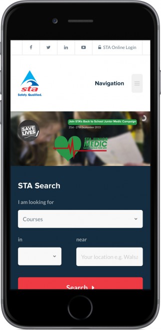
The clean, modern-looking site also works exceptionally well on mobile and tablet devices.
With so much information to present, we’ve thought long and hard as a team about what our members need when they log on to the site and how they search for courses, news, and resources. We believe the new design is now more functional and will make it far easier for people to navigate and find what they need on the website quickly
We are really pleased with the user-friendly, uncluttered design, too, because it uses the screen space to maximum effect.
Brett Preston, Head of IT
The site features distinct sections on STA qualifications, awards, and services, as well as a dedicated membership section. Our new STA Search facility has been completely re-built from the ground-up, making it easier than ever before to find upcoming courses, seminars, jobs and nearby pools. Prospective candidates can even enquire about upcoming courses with the organisers directly through the search facility!
- Categories
- Association News


